网页开发入门|20 综合练习三:用户登录
又来到了综合练习时间,这一次我们将综合使用之前课程中所学习到内容,来开发一个用户注册的页面,


经历了漫长知识性学习,又来到了综合练习时间。
这一次我们将综合使用之前课程中所学习到内容,一起来开发一个用户注册的页面,在实践中感受一下网页三大要素 HTML,CSS,JS如何在一起工作。

卡片的实现
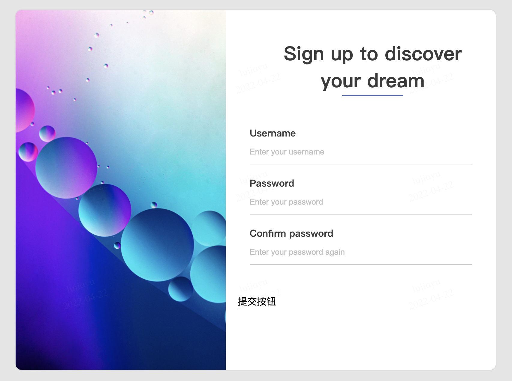
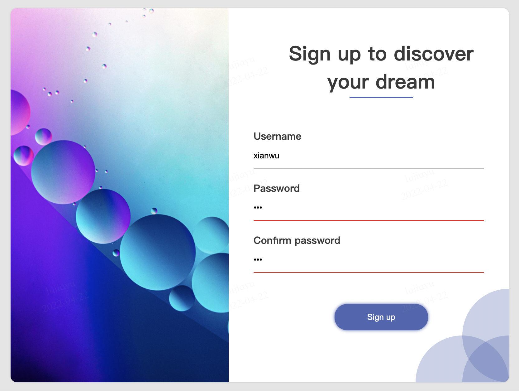
从设计图中可以看到,这是一个简单的用户注册页面,整体上呈卡片形式。
卡片是在网页中比较常见的设计语言。
卡片可以给用户边界感,让用户知道它所需要关注的内容在有限的空间内,同时分隔开了其它内容,让用户更加的聚焦。
在HTML中使用CSS实现卡片也很容易,在固定宽高的块级元素的基础上,增加边框和阴影就可以呈现一种卡片的感觉。
<div class="card">
</div>
/*
    body是所有元素的父元素,
    使用body标签选择器,设定整个页面的基础样式。
    此处将页面背景设定为灰色,以突出白色的卡片。
*/
body {
	background-color: #e5e5e5;
}
/*
    使用类选择器,对卡片元素样式进行设定,
    固定宽高800*600,并增加边框圆角和阴影。
    overflow属性可以在内部元素溢出卡片的圆角边界时,隐藏溢出的部分。
*/
.card {
	background-color: white;
    width: 800px;
    height: 600px;
    border-radius: 10px;
    overflow: hidden;
    box-shadow: 0 0 2px #bfbfbf;
}
因为页面里没有其它元素,将卡片居中显示可以改善页面平衡。
为此,我们为卡片元素再设定另外一个类,专门用于让卡片居中。
<div class="card card-center">
</div>
在HTML中,元素可以有多个类,多个类中定义的样式会依次生效。这样的好处是可以将页面上某类元素的公共属性放在一个类中,如卡片的尺寸、颜色等,而其它特定的效果放到另外一个类中,如定位等,修改起来互不影响。
/*
    使用绝对定位将卡片定位到页面中心。
    left和top的50%,指的左边和上边移动到整个页面(浏览器窗口)的一半。
    transform和translate(-50%,-50%),指将元素向左和上移动元素尺寸的一半。
    联合使用这一组样式,即可让元素页面居中
*/
.card-center {
    position: absolute;
    left: 50%;
    top: 50%;
    transform: translate(-50%, -50%);
}

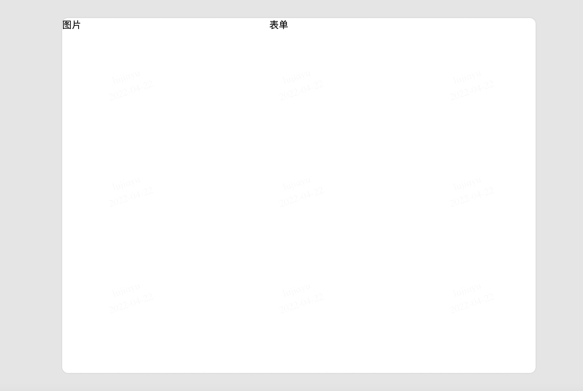
卡片分栏
接下来,可以看到设计稿中的卡片又分为左右两栏,左侧使用图片丰富了页面的色彩,右侧为用户要填写的表单。

使用flex或grid布局可以快速完成分栏效果,因为页面中元素的尺寸是固定的,此处选择使用更加简单的flex布局。
<div class="card card-center">
    <div class="card-layout">
        <div class="card-layout-left">
            图片
        </div>
        <div class="card-layout-right">
            表单
        </div>
    </div>
</div>
.card-layout {
    display: flex;
}
/*
    左边图片部分宽350px
*/
.card-layout-left {
    width: 350px;
}
/*
    右边表单部分宽450px
*/
.card-layout-right {
    width: 450px;
}
这样就完成了左右分栏。
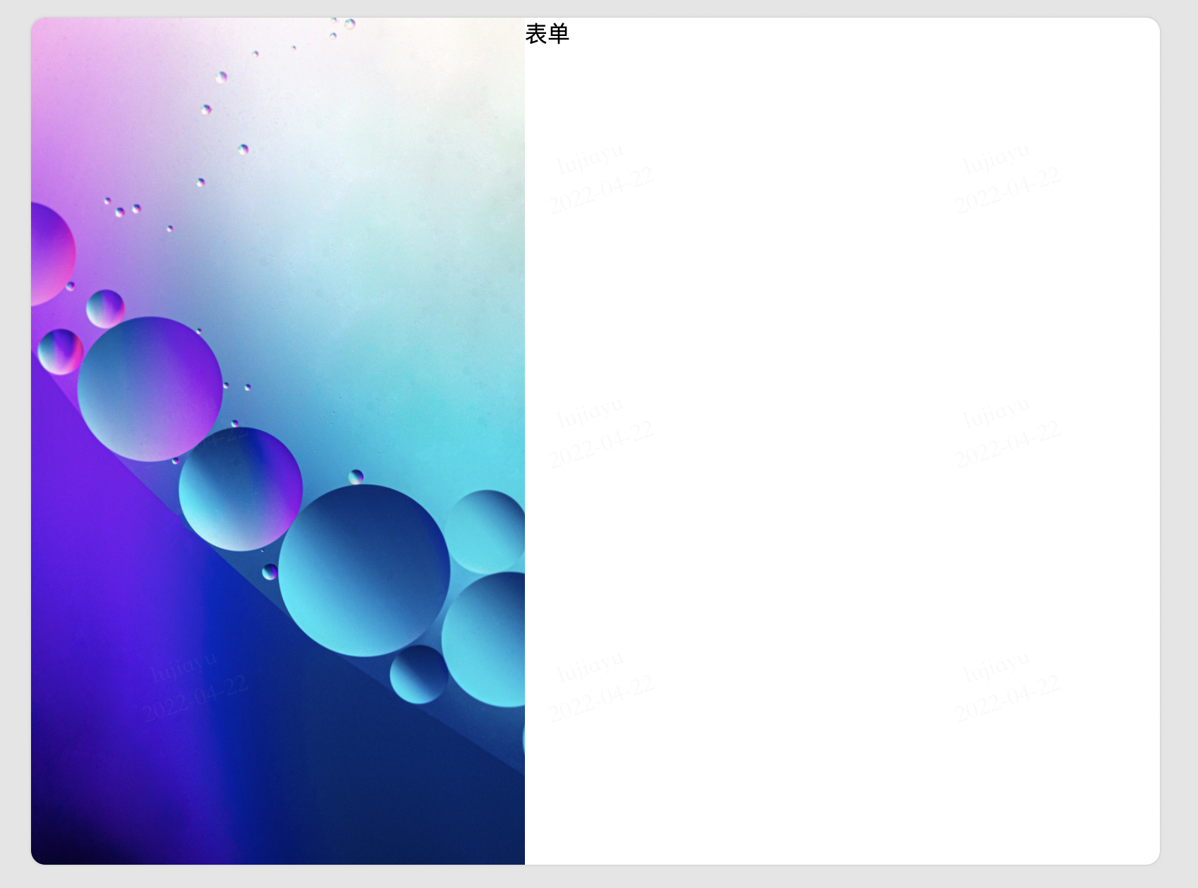
放入图片
先完成卡片左侧的图片,使用img标签即可插入图片。
<!-- 省略其它部分代码 -->
<div class="card-layout-left">
    <img class="theme-img" src="assets/dustin.jpg" alt="theme">
</div>
原始图的尺寸不一定会与卡片中需要的尺寸一致,需要对图片进行裁剪。
/*
    设定图片尺寸,默认效果是对图片进行缩放
    将object-fit设定为cover,将缩放效果改为裁剪
*/
.theme-img {
    object-fit: cover;
    width: 350px;
    height: 600px;
}
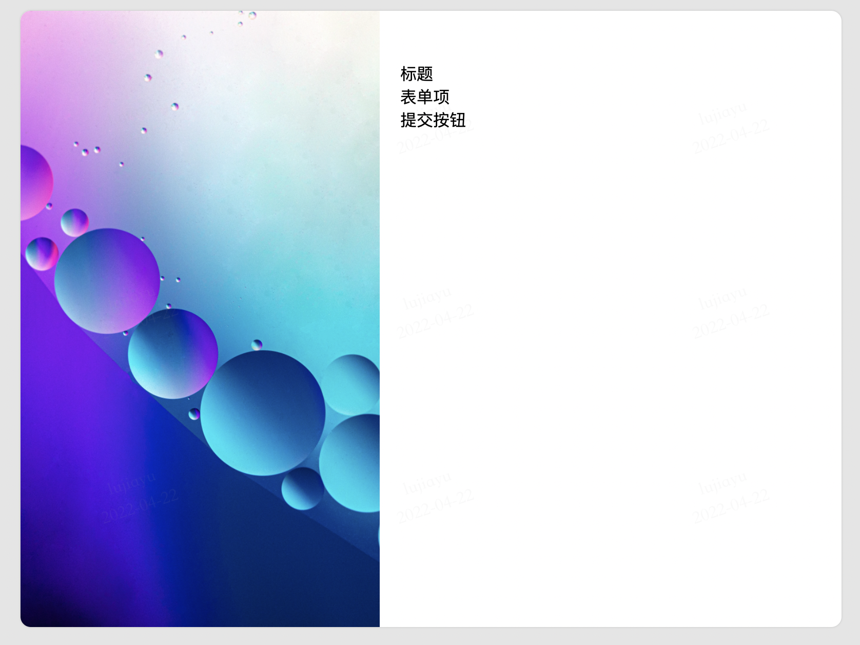
放入表单
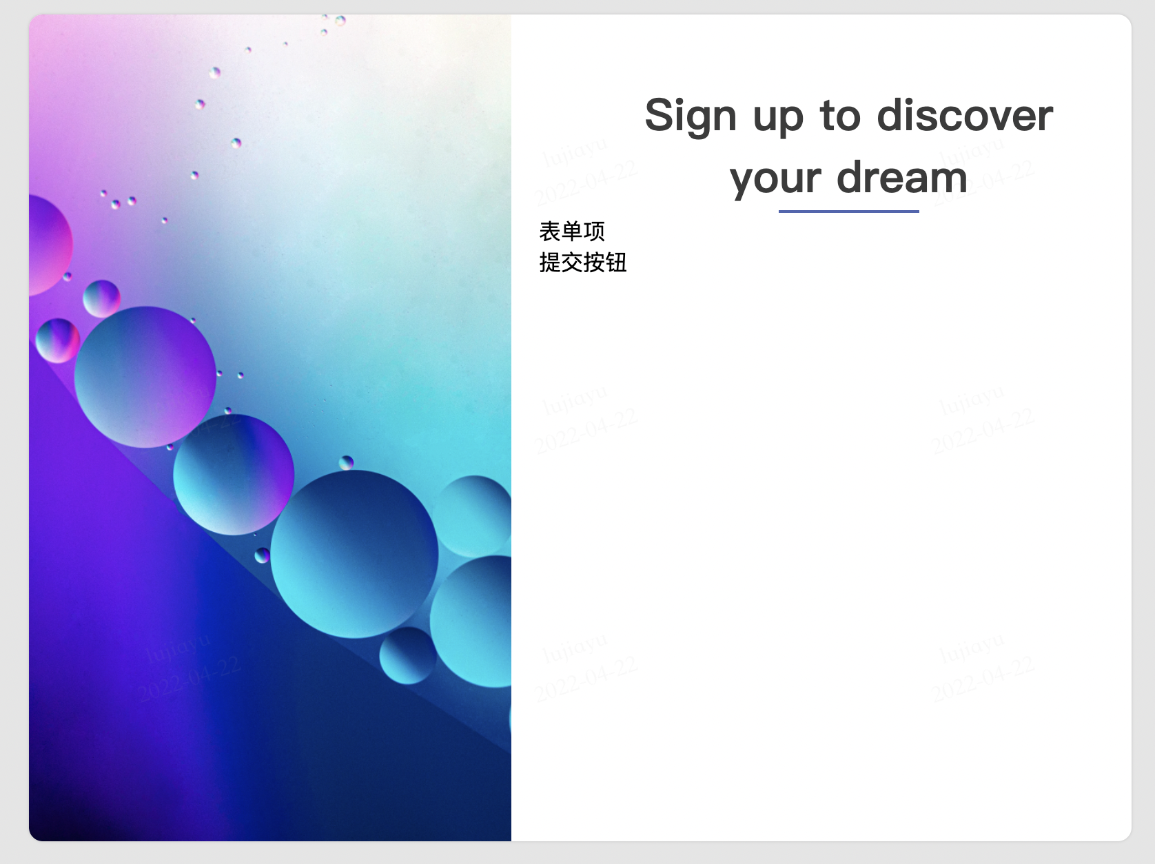
右侧的表单主要由三部分组成,大标题、表单项、提交按钮。

<!-- 省略其它部分代码 -->
<div class="card-layout-right">
    <form class="signup-form">
        <div class="signup-form-title">标题</div>
        <div class="signup-form-items">表单项</div>
        <div class="signup-form-submit">提交按钮</div>
    <form>
</div>
/*
    设定表单整体的宽度和边距等基本属性
*/
.signup-form {
    width: 450px;
    margin: 50px 20px;
}
美化表单标题
表单标题的内容为居中显示,为了进一步突出,还需要加大字号和字重。
同时,默认的文字是黑色,对比度过于强烈。为了让视觉更加柔和,将字体颜色改为墨色。
<!-- 省略其它部分代码 -->
<div class="signup-form-title">
    Sign up to discover<br>your dream
</div>
/*
    设定标题的基本属性
*/
.signup-form-title {
    text-align: center;
    color: #3b3b3b;
    font-size: xx-large;
    font-weight: bolder;
}
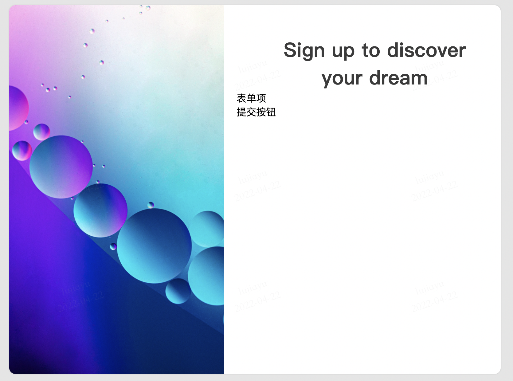
接下来,在标题下方放一个短线段,从视觉上可以起到支撑的效果,提升页面整体的结构感。
<!-- 省略其它部分代码 -->
<div class="signup-form-title">
    Sign up to discover<br>your dream
</div>
<div class="signup-form-spliter"></div>
/*
    使用css绘制一条线段
*/
.signup-form-spliter {
    width: 100px;
    border: 1px solid #4e66b1;
    margin: 2px auto;
}
基础图形的使用在平面设计中非常有用,运用得当可以极大的提升页面的质感。
美化表单项
用于注册的表单内容较少,使用垂直排列可以让页面看起来会更加流畅。
用于表单项的label和input都是行内元素,默认情况下将横向排列。通过修改它们的样式属性display: block可以将其强行转化为块级元素,即可以实现纵向排列。
<!-- 省略其它部分代码 -->
<div class="signup-form-items">
    <div class="signup-form-item">
        <label for="username" class="signup-form-item-block">
            Username
        </label>
        <input name="username" class="signup-form-item-block"
        placeholder="Enter your username">
    </div>
	<!-- 省略其它表单项 -->
</div>
.signup-form-item {
    margin: 20px;
}
/*
    将表单项改为块级元素
*/
.signup-form-item-block {
    display: block;
}
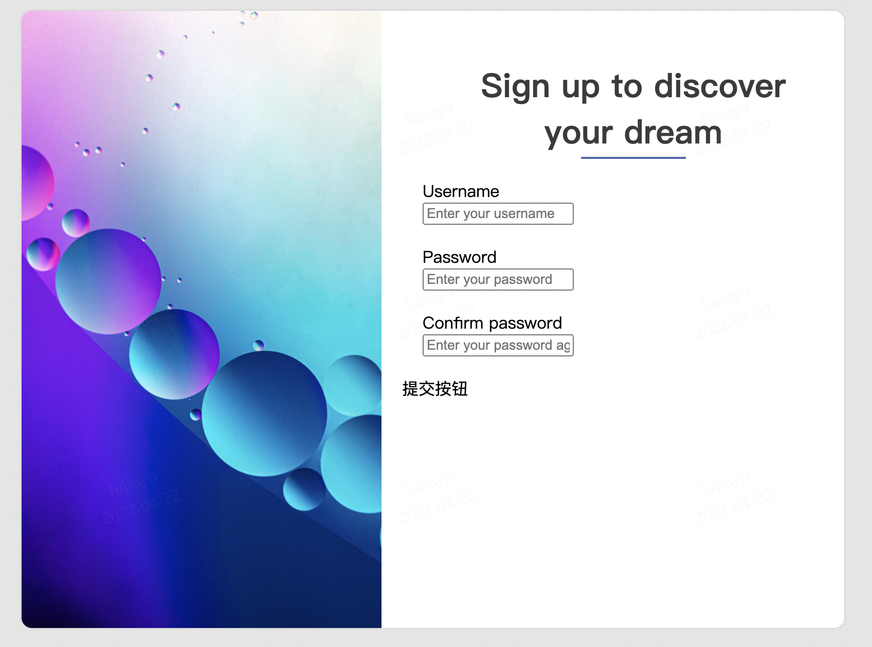
然后分别调整label和input的样式,使之与页面风格统一。
.signup-form-item-label {
    display: block;
    color: #3b3b3b;
    font-weight: bold;
}

.signup-form-item-input {
    display: block;
    outline: none;
    border: 0;
    border-bottom: 1px solid #bfbfbf;
    padding: 0;
    width: 370px;
    line-height: 3em;
}
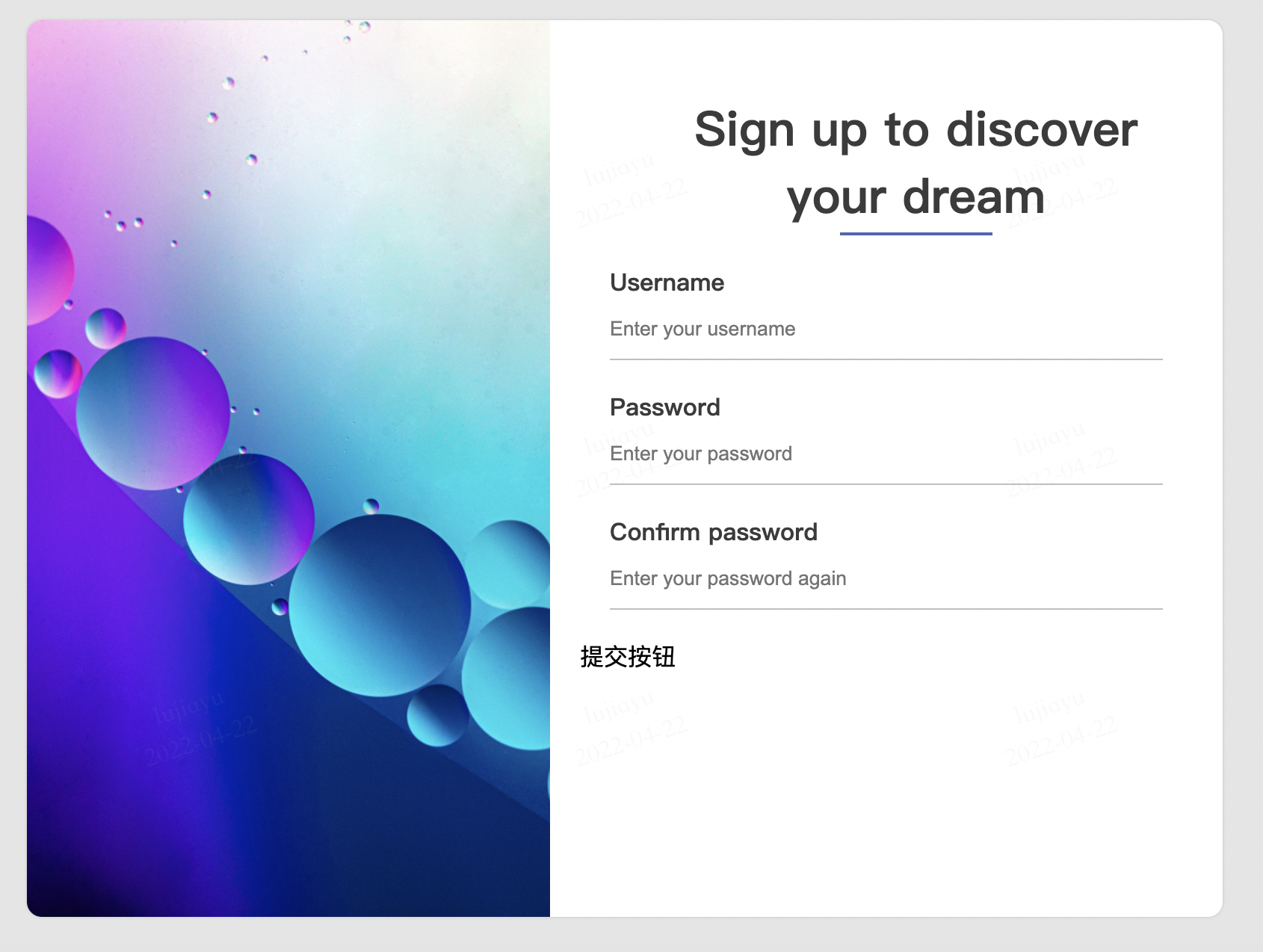
由于我们将label的字体颜色调浅了,于是input元素的placeholder的颜色看起来太黑了。
placeholder在页面上并不是一个独立的元素,调整placeholder需要使用一个新的CSS选择器,伪元素选择器。
/*
    伪元素选择器,可以选中一些不为元素的特殊内容
*/
.signup-form-item-input::placeholder {
    color: #bfbfbf;
}
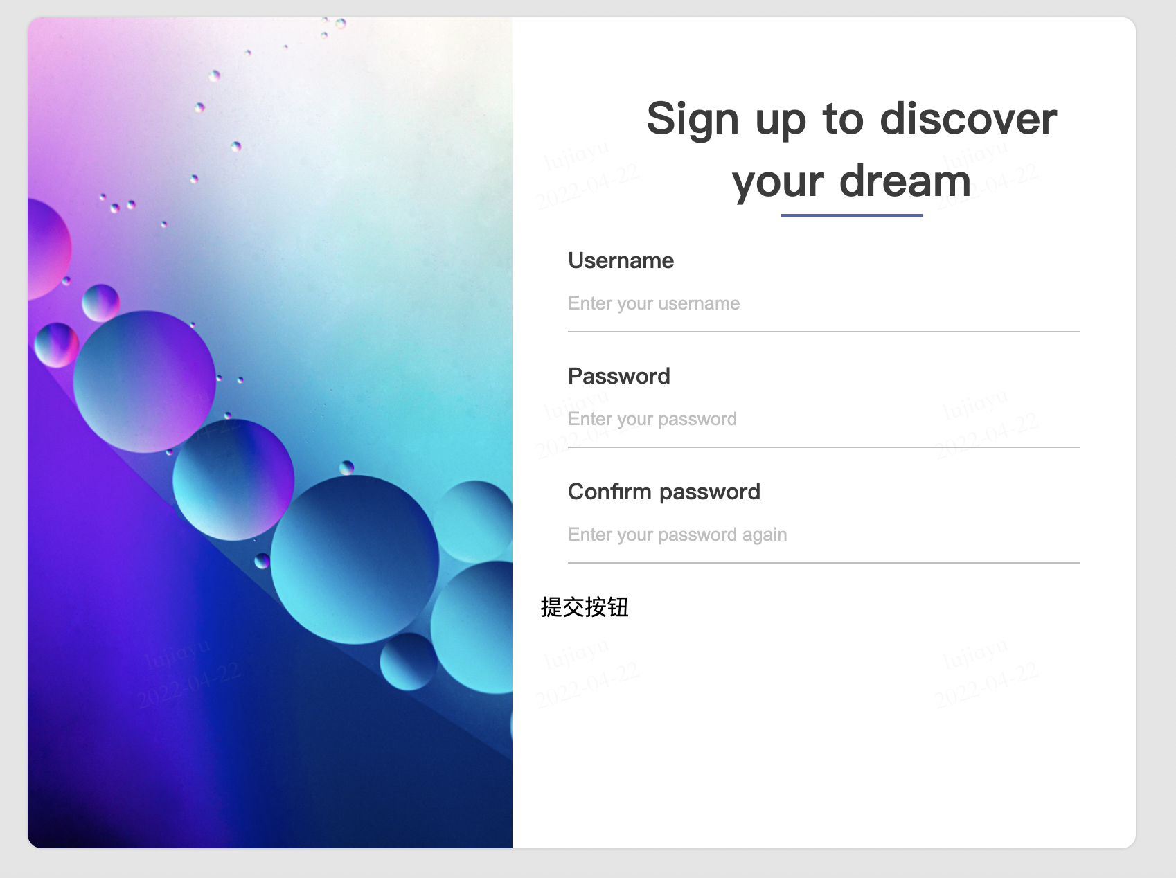
最后调整一下这部分整体的边距。
.signup-form-items {
    margin: 50px 0;
}
美化提交按钮
提交按钮的美化与上述方法类似,直接看代码:
<!-- 省略其它部分代码 -->
<div class="signup-form-submit">
	<input name="submit" type="submit" class="signup-form-submit-button" value="Sign up">
</div>
.signup-form-submit {
    margin: 20px;
}

.signup-form-submit-button {
    display: block;
    width: 150px;
    margin: 20px auto;
    line-height: 3em;
    color: white;
    background-color: #4e66b1;
    border: 0;
    border-radius: 20px;
    box-shadow: 0 0 5px #4e66b1;
}
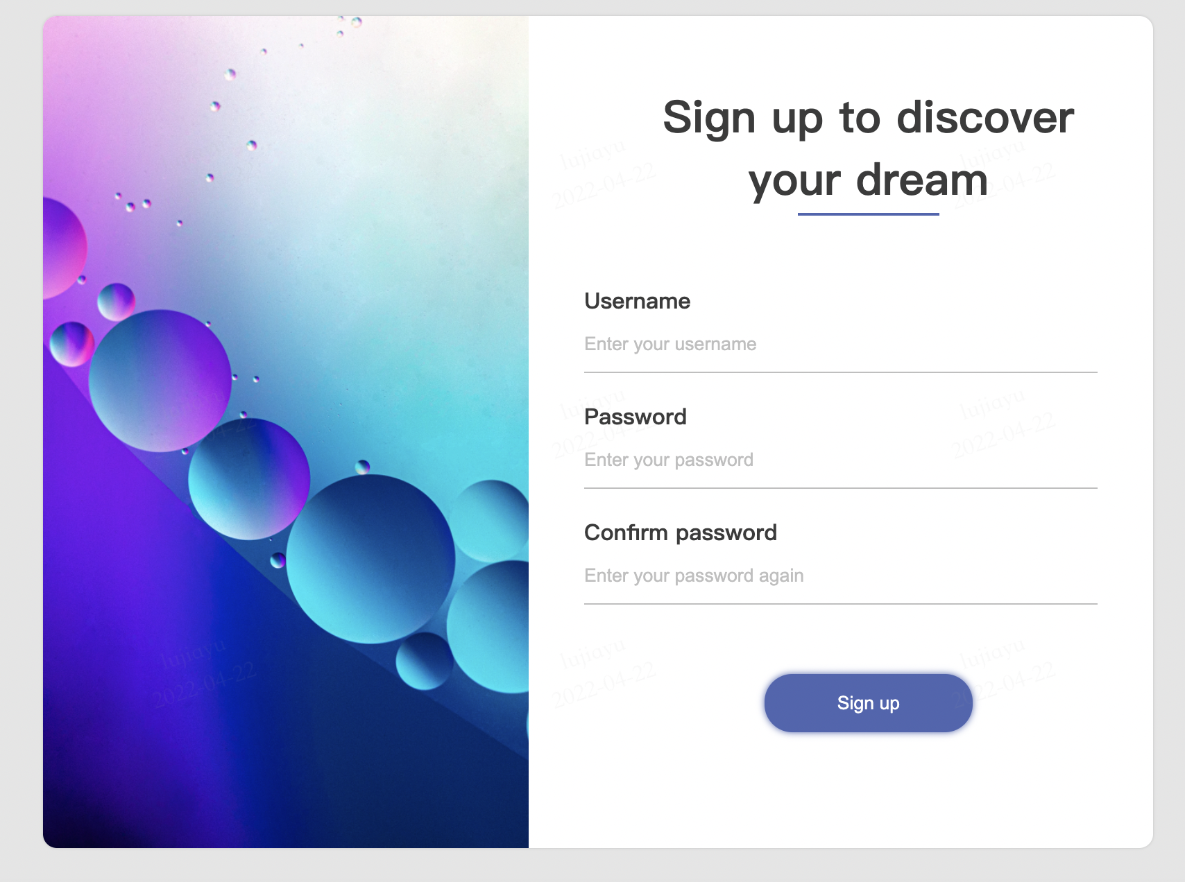
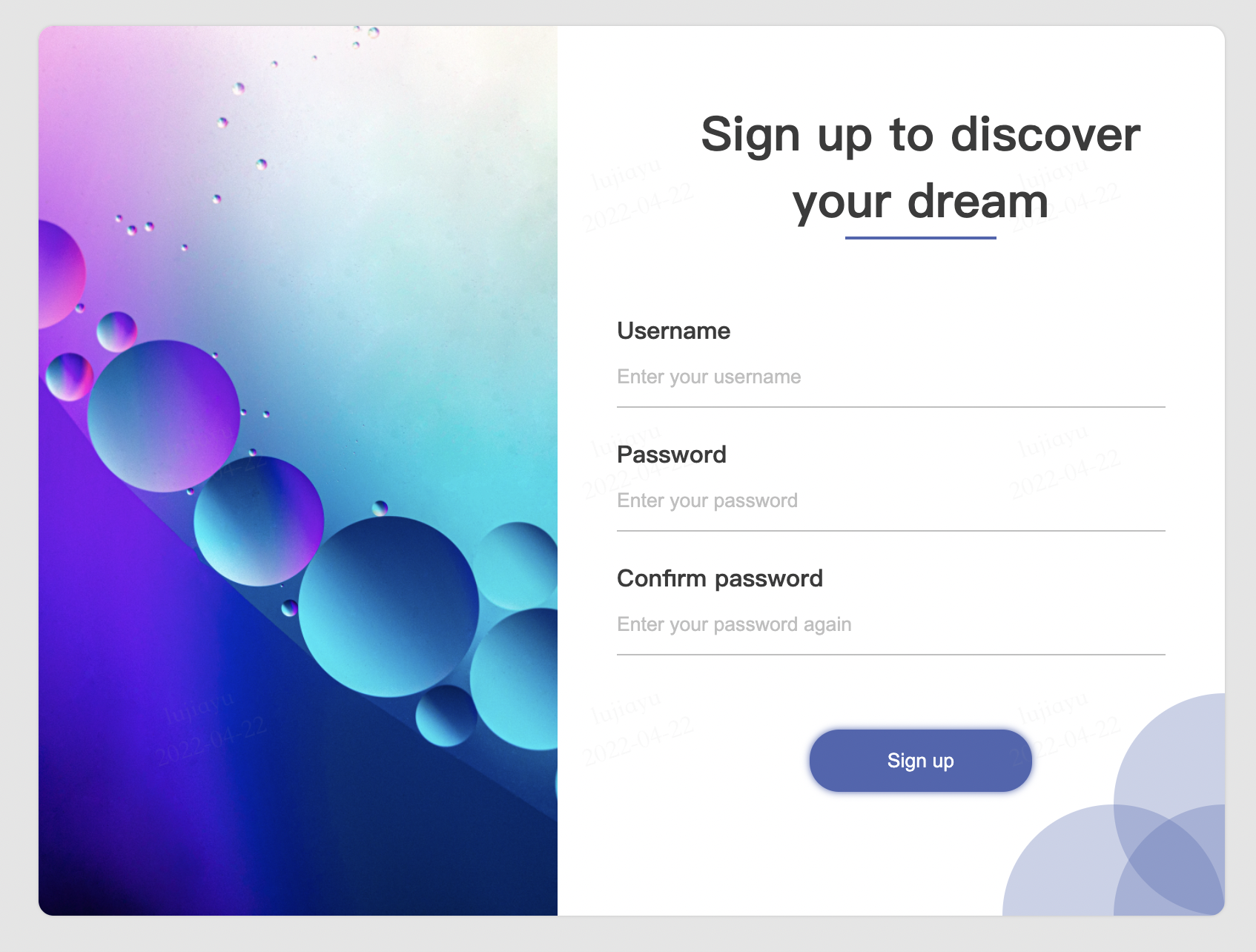
装饰
现在,整体上看起来表单的下方看起来有些空,视觉上画面向左上角倾斜。最后我们使用CSS绘制一些基本形状平衡一下页面。
<div class="signup-form-footer">
    <div class="signup-form-footer-circle-1"></div>
    <div class="signup-form-footer-circle-2"></div>
    <div class="signup-form-footer-circle-3"></div>
</div>
.signup-form-footer-circle-1 {
    position: absolute;
    right: 0;
    bottom: 0;
    transform: translate(50%, 50%);
    width: 150px;
    height: 150px;
    background-color: rgba(78, 102, 177, 0.3);
    border-radius: 50%;
}

/* 省略其它相似代码 */
至此,我们页面的样式部分完成。
提交表单前的检查
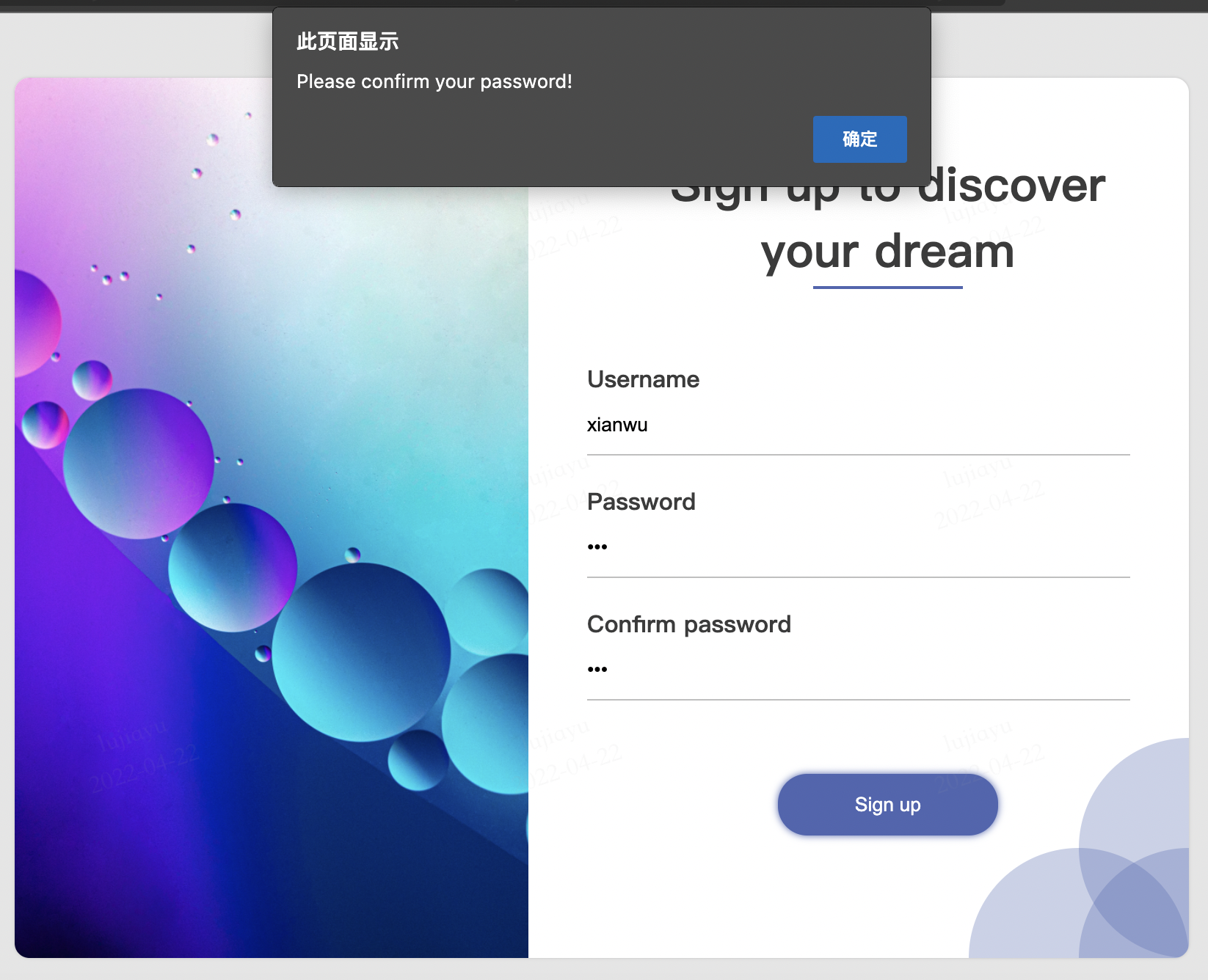
在用户注册时,为了避免用户意外的输入了错误密码,导致账户再也无法登录,所以通常会要求用户输入两边密码予以确认。
我们需要使用脚本代码,在用户提交表单时,检查用户的两次输入是否一致。如果不一致应该阻止表单的提交,并提醒用户错误原因。
在<form>标签中使用onsubmit属性,可以监听到用户提交表单的事件。并且当事件发生时,还会产生一个event变量,可以作为参数传入自定义函数,以获取用户的输入,或阻止事件的发生。
<form class="signup-form" onsubmit="checkPassword(event)">
通过event.target可以获取用户的表单输入。表单中密码input元素的name为password,就可以使用event.target['password']得到用户输入的密码。
通过将event.returnValue = false即可在脚本中取消事件的发生,即阻止用户提交表单。
function checkPassword(event) {
    // 获取表单中用户输入的内容
    password = event.target['password'].value
    confirmPassword = event.target['confirm-password'].value
    if(password !== confirmPassword){
        // 提醒用户输入有误
        alert("Please confirm your password!")
        // 阻止表单继续提交
        event.returnValue = false
    }
}
为了进一步提升用户体验,我们还可以在用户输入有误时,使用特殊的样式标记出有问题的表单项。这可以通过为相应input元素添加新的样式类来实现。
.signup-form-body-item-input-error {
    border-bottom: 1px solid red;
}
function checkPassword(event) {
    // 获取表单中用户输入的内容
    password = event.target['password'].value
    confirmPassword = event.target['confirm-password'].value
    if(password !== confirmPassword){
        // 提醒用户输入有误
        alert("Please confirm your password!")
        // 修改密码输入框的样式,让用户注意到出错处
        event.target['password'].classList.append("signup-form-body-item-input-error")
        event.target['confirm-password'].classList.append("signup-form-body-item-input-error" )
        // 阻止表单继续提交
        event.returnValue = false
    }
}
小结
通过本次的练习,我们了解了如何综合使用 HTML,CSS,JS完成一个有实际功能的页面,相信你对如何进行网页开发有了更深的认识。
我将本课程所有的代码托管在gitee上了,你可以点击这个链接,或到gitee.com上搜索弦五 网页开发入门,查看和获取本课程的全部代码。